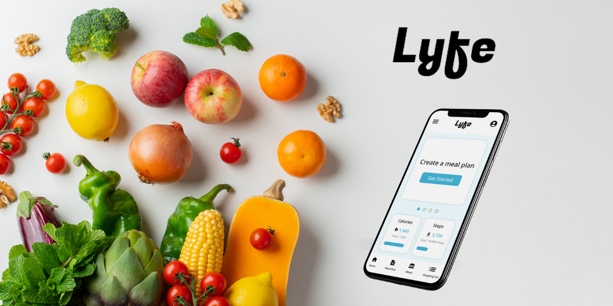
Project
Lyfe Health
Google UX Project
Role
Interviewing
Ideating
Wireframing
Prototyping
Usability Testing
Iterating
Tools
Pen + Paper
Figma
Jamboard
Duration
June – September, 2022
Challenge
People live busy lives and creating a diet that not only fits health goals like fitness and weight but also considers ailments/allergies that limit or prevent one from eating certain foods is a very time intensive pursuit.
Solution
To design an app that takes into account all health considerations to create a meal plan with recipes and a shopping list to help people achieve their diet goals.
Research
Summary
The research showed that people do place a high importance on their diet/health goals and sometimes do find it difficult to create a perfect meal plan. I learned that if there was an app that could do this for them automatically they would be more inclined to eat a better diet.

Persona
Tyler, 32
Common Law
Accountant
Tyler is an accountant who lives with his partner and is dedicated to a healthy lifestyle. He has been dealing with a recent medical condition and is also allergic to gluten so meal planning can sometimes be a chore. His work is conducted on his work or home PC so he prefers if he can access the software from there.
Goals
- The related objectives this person wants to successfully complete
Frustrations
- The issues or pain points that they encounter or try to avoid
Competitive Audit
An audit of a few competitor’s products provided direction on gaps and opportunities to address with the Lyfe app.

My Fitness Pal
Type
Direct
Strength
+ easy to navigate, organized
+ consistent use of typography, color palette
Weakness
– only in one language
– small spacing & typography

Noom Weight Loss
Type
Indirect
Strength
+ available in two languages
+ menu and other info easy to find
Weakness
– missing informative footer, no terms

Strava Fitness
Type
Indirect
Strength
+ consistent use of typography, color palette and general design ethos
Weakness
– only in one language
– key info present, not convoluted
Design Process
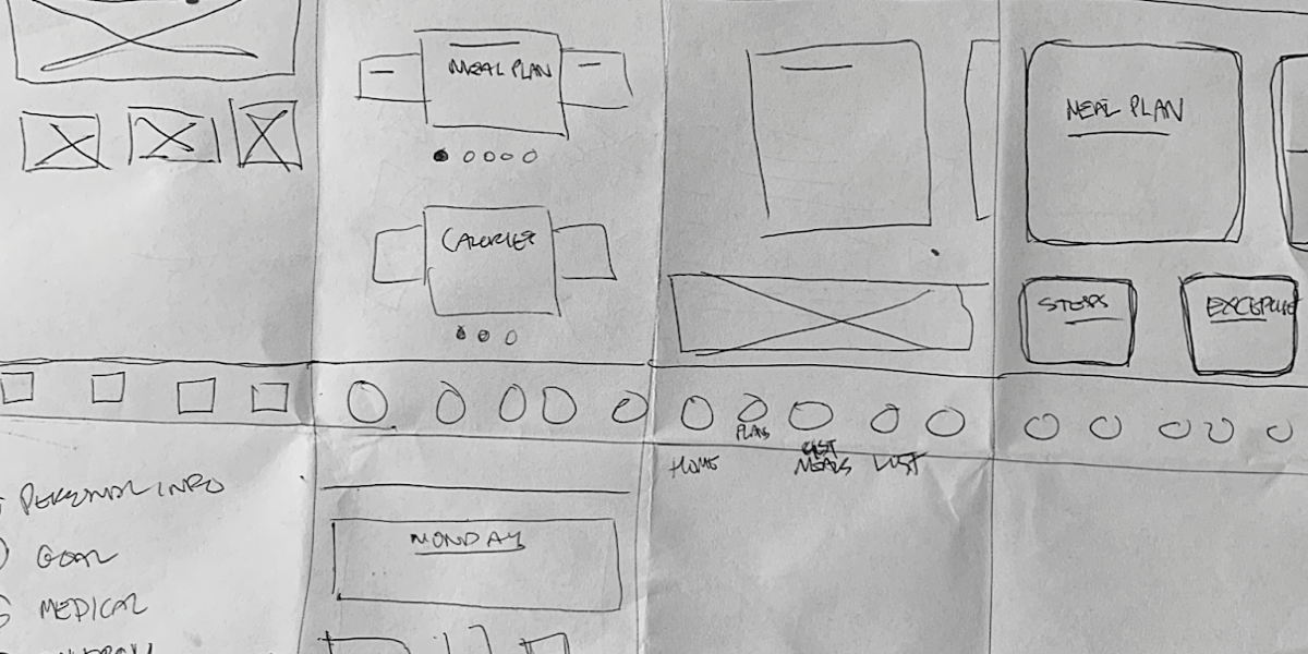
Paper Wireframes
I did a quick ideation exercise to come up with ideas for how to address gaps identified in the competitive audit. My focus was specifically on a simple flow to capture necessary information in regards to creating a custom diet plan.
Digital Wireframes
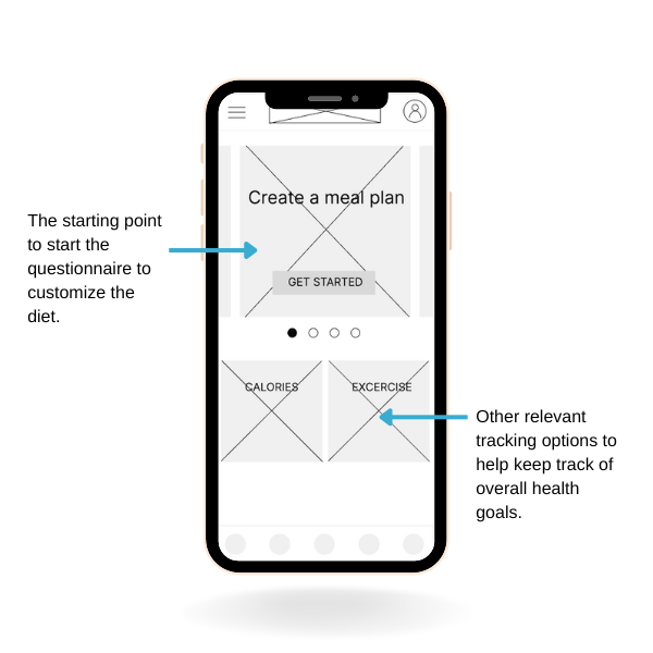
After ideating and drafting some paper wireframes, I created the initial designs for the Lyfe app. These designs focused on delivering personalized guidance to users to help create a customized diet plan.
Low-Fidelity Prototype
Usability Study Findings
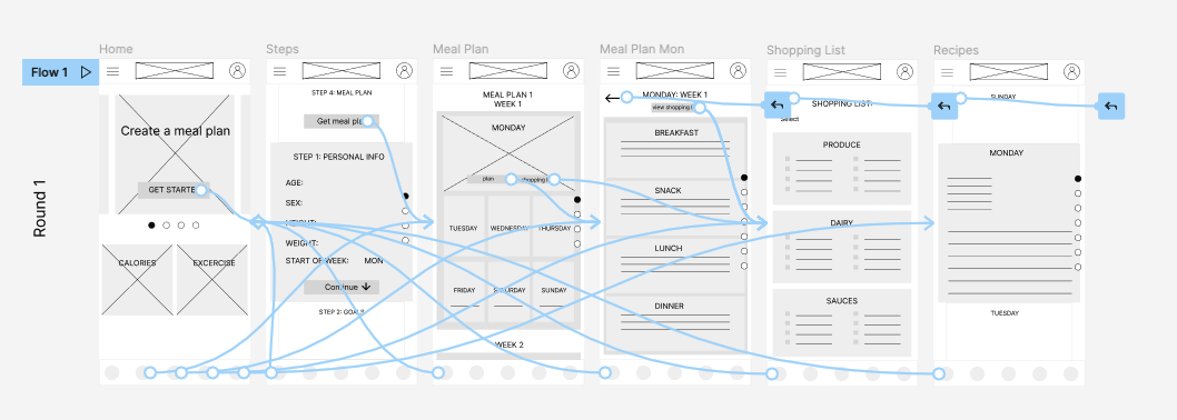
People had trouble understanding what step of the process or part of the app they were in
People were confused by the design choice since it was hard to read
Two out of three users had trouble with the organization of the app sections
Mockups
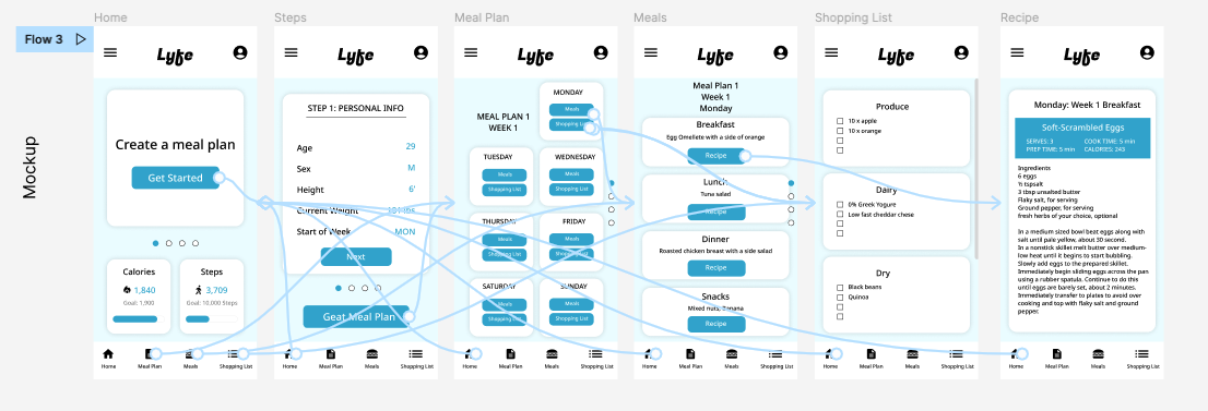
Based on the insights I created more logical setup for the questionnaire. Previously moving forward was unclear since it appears the user can drag up or down on the screen. The new design clearly shows one step at a time with a next button.
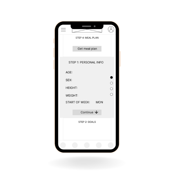

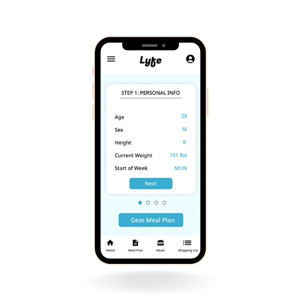
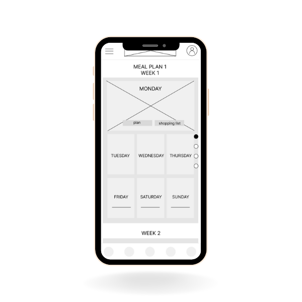
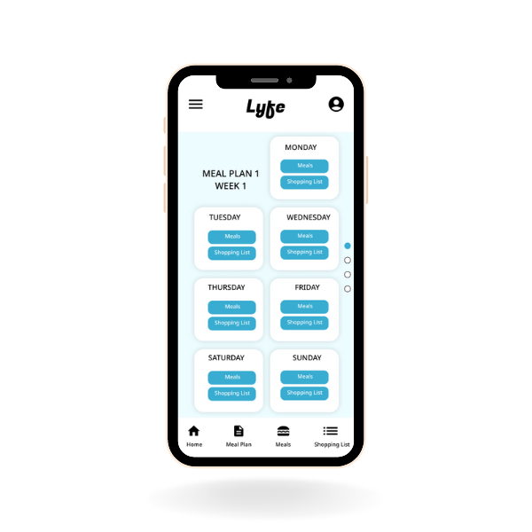
The design was further enhanced by resizing certain sections to provide a consistent look and feel. Additionally, I added explanatory text to the footer menu to help users better understand the icons.

Final Design
Hi-Fidelity Prototype
Final high fidelity prototype presented a clear flow with all the more logical options that allow the user to move around the app less friction. It also achieved the needs for simple ordering process and progress tracking
Lyfe Health Prototype
Outcomes
Impact
The app assists individuals in developing highly tailored meal plans that cater to their unique health requirements. I believe this feature is crucial since everyone has distinct health concerns, and there is no single solution that works for all.
What I learned:
By implementing changes to my design, I was able to enhance the user experience and enable our target audience to navigate through the process of creating and managing their custom diet plan with ease. Specifically, I focused on making the flow more intuitive and ensuring that users could easily locate the relevant sections. The design updates involved resizing certain elements to ensure consistency and adding descriptive text to the footer menu to provide more clarity on the available options. More iterations can be made to add more beneficial health tracking and suggestions like exercise routines.
Next Steps
1. Conduct another usability study to determine if the previous challenges have been addressed.
2. Provide incentives and rewards to users for successfully reducing their food waste.
3. Insert a few sentences summarizing the next steps you would take with this project and why.
