

Project
Sandwich Shop App
Google UX Project
Role
Interviewing
Ideating
Usability Testing
Wireframing
Prototyping
Iterating
Tools
Pen + Paper
Figma
Jamboard
Duration
June – September, 2022
Challenge
Busy professionals have limited time to cook healthy meals and rely on ordering takeout. The process of ordering takeout is complicated due hard to find and difficult to navigate menus, and imprecise meal prep times, resulting in customers wasting time waiting or getting cold food.
Solution
The Sandwich Shop app will categorize menu items neatly and present them in a visually pleasing layout for easy navigation. Additionally, it will offer a dynamic progress bar to show real-time updates on orders.
The Sandwich App will let users buy healthy sandwiches which will affect users with little time by allowing users to make simple buying decisions and track progress.
Research
Summary
After conducting interviews and creating empathy maps, one of the primary user groups identified were professionals who are busy with work and don’t have time to cook meals. In addition, extracurricular activities and family obligations contributed to their lack of time to cook healthy meals at home.
Pain Points
Time
Professionals are too busy to cook healthy meals
Efficiency
Restaurants do not offer precise meal preparation times
Use
Menus can be cluttered, hard to read or locate
")
Persona
Jesse, 27
Single
Bank Professional
Jesse is a young professional who is busy with work and extracurricular activities. She’s single and often buys dinner on her way home.
Goals
- Spend free-time on activities and loved ones
- Eat a healthy diet
Frustrations
- Menus are hard to navigate or locate
- Challenging to guess when food is ready for pickup
User Journey Map
It was evident after mapping Jesse’s user journey that having an live order status is very important to improve the user experience.

Design Process
Paper Wireframes
Numerous iterations of each app page were sketched, and the most refined version of each was extracted and assembled to form the main process flow.

Digital Wireframes

Low-Fidelity Prototype

Usability Study Findings
Round 1 Findings
Too many steps to finalize an order
How to customize sandwich?
How to remove sandwich?
Round 2 Findings
Create account option was hard to find
Checkout process was unintuitive
Mockups
From challenge to solution
After adding items to the bag, the logical next step was unclear. I converted the summary page into a full screen overlay and provided only “checkout” or “close page” as the only options. The overlay communicated the idea that the bag is separate and can be accessed at any stage in the process. Furthemore, based on usabilty findings, an “edit” and “remove” option were added to each sandwich order to allow customization of the sandwich and overall order.


Users displayed confusion when attempting to find the account page. I substituted the “checkout” icon in the footer row with an “account” icon. This change was made because users have the option to proceed with the checkout process directly from the bag overlay screen and keeping the “checkout” icon on the main screen seemed redundant.


Final Design
Final high fidelity prototype presented a clear flow with more logical options that improved how the user navigated the app.

Sandwich Shop Protoype

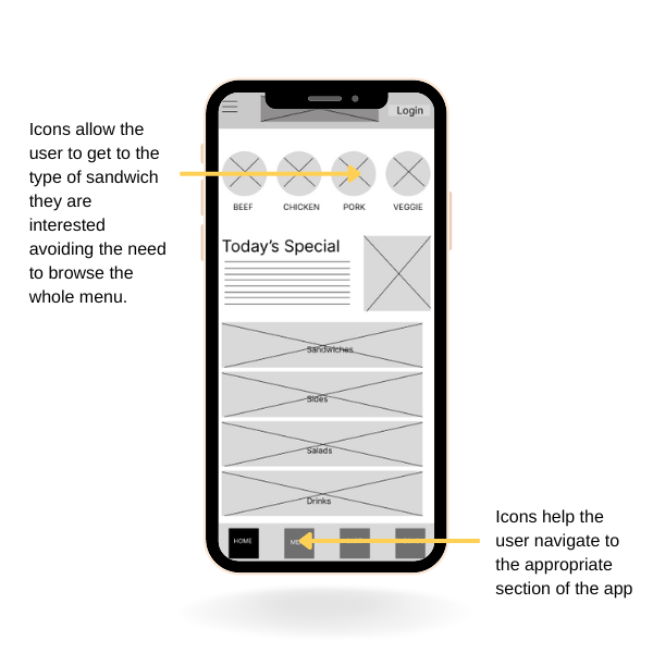
Accessibility Considerations
1. Used images for sandwiches to allow users to more easily identify the sandwich type
2. Used color contrast that meets accessibility requirements for improved readability
3. Used icons to allow users to find various sections of the app more readily
Outcomes
Impact
The primary objective of the app was to provide busy individuals with a seamless experience when ordering sandwiches. One key feature that helped achieve this was the order progress bar, which allowed busy professionals to anticipate their pickup time and better manage their arrival. Overall, the app succeeded in providing a convenient and efficient solution for ordering healthy food.
What I learned:
Usability studies revealed challenges users had that contradicted my original assumptions. For example users were challenged when wanting to customize a sandwich or checkout. Prototypes and usabilty testing were essential in uncovering these pain point and the feedback was used to rework the design.
Next Steps
1. Conduct another usability study to determine if the previous challenges have been addressed.
2. Conduct more research to determine if there are any more opportunities to improve the app.