Project
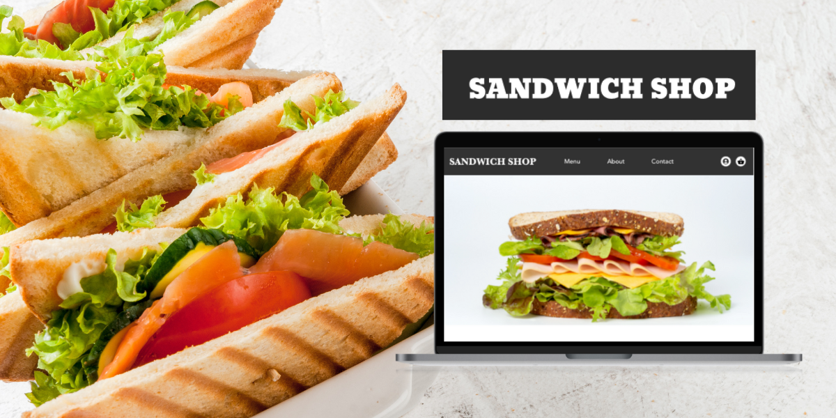
Sandwich Shop Site
Google UX Project
Role
Interviewing
Ideating
Wireframing
Prototyping
Usability Testing
Iterating
Tools
Pen + Paper
Adobe XD
Jamboard
Duration
June – September, 2022
Challenge
Sites selling food can often times too be cluttered and offer too much choice.
Solution
Design a site that is clean, organized and informative that will lead to a seamless user experience.
Research
Summary
One of the primary user groups identified were professionals who are busy with work and don’t have time to cook meals.
It was found that users had a hard time making selections and finalizing an order because the menu and ordering process were not straightforward.
Pain Points
Menu
Menus are often cluttered and hard to read
Efficiency
Sites don’t always provide clear information about progress/current order

Persona
Jesse, 27
Single
Bank Professional
Jesse is a young professional who is busy with work and extracurricular activities. She’s single and lives with 2 roomates. She often buys dinner for everyone on her way home but she’s too busy to call so she prefers apps. She likes being suggested meals.
Goals
- Spend energy on activities and time withs friends
- Eat healthy
Frustrations
- Not easy to find healthy food with positive ordering experiences
User Journey Map
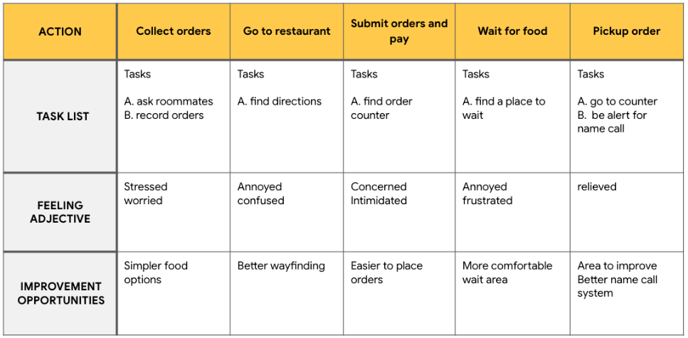
It was evident after mapping Jesse’s user journey that having an live order status is very important to improve the user experience.
Design Process
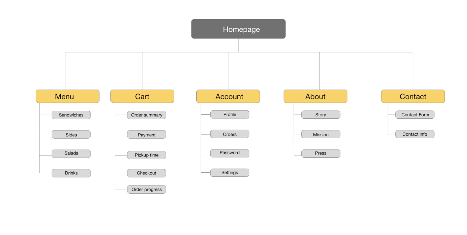
Sitemap
Paper Wireframes
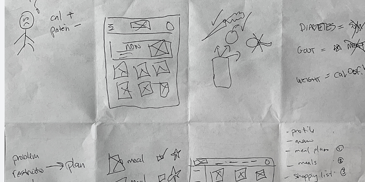
I ran a crazy 8’s exercise to get some ideas down a piece of paper to generate solutions and understand pain points.
Digital Wireframes
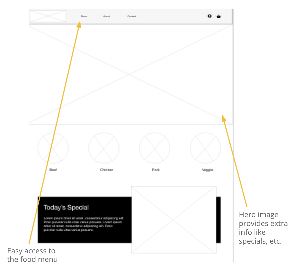
Making sure key elements were easy to find was important to improving the user experience.
A user should be able to find important links like the food menu and specials.
Low-Fidelity Prototype
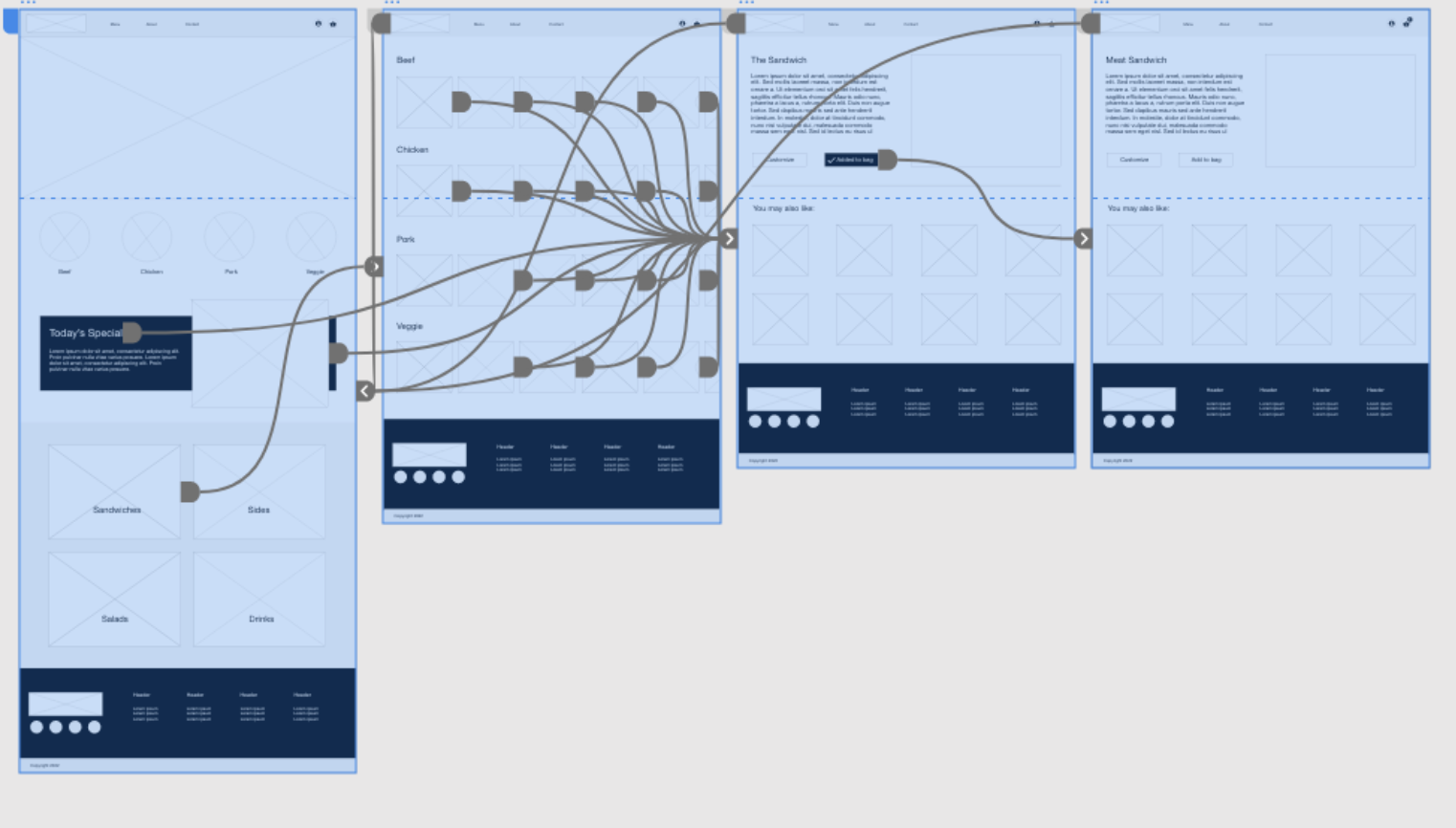
I created a low-fidelity prototype to test the connection between all the user screens that complete a primary user flow.
After feedback, I made notes to ensure the most viable ones are iterated on to improve the user experience.
Usability Study Findings
I conducted two rounds of useability studies. The first study helped guide designed to the wire frames to mockups. The next study helped understand what parts of the high fidelity prototype can be improved through the mockups.
Cart
There was no way to know if you had added an item to the cart
Checkout
The user didn’t have an option to create an account once at checkout
Cart
There was no way of removing an item or changing the quantity of items after adding to the cart.
Mockups
Using the insights from the usability study, I added two new elements to convey to the user that their add to cart action did take effect.


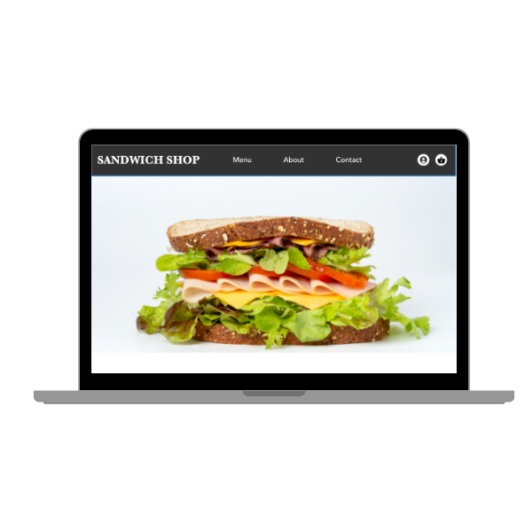
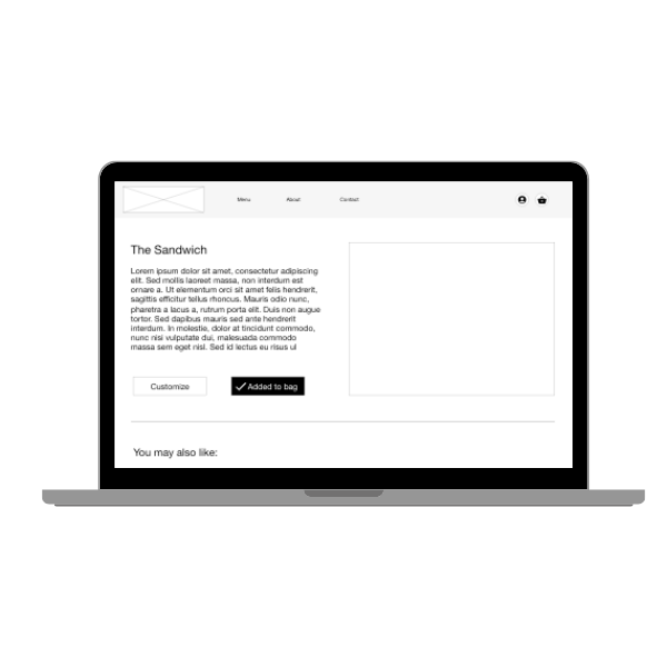

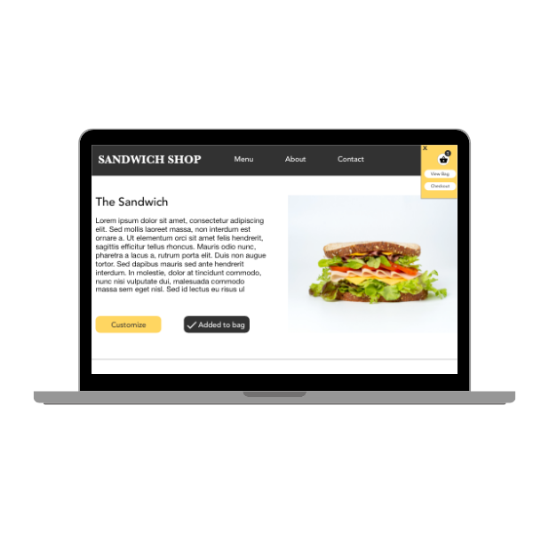
User can see that the item was added to the cart in the top right of the screen as well as the total number of items currently in the cart.
Final Design
Hi-Fidelity Prototype
Final high fidelity prototype presented a clear flow with all the more logical options that allow the user to move around the app less friction. It also achieved the needs for simple ordering process and progress tracking
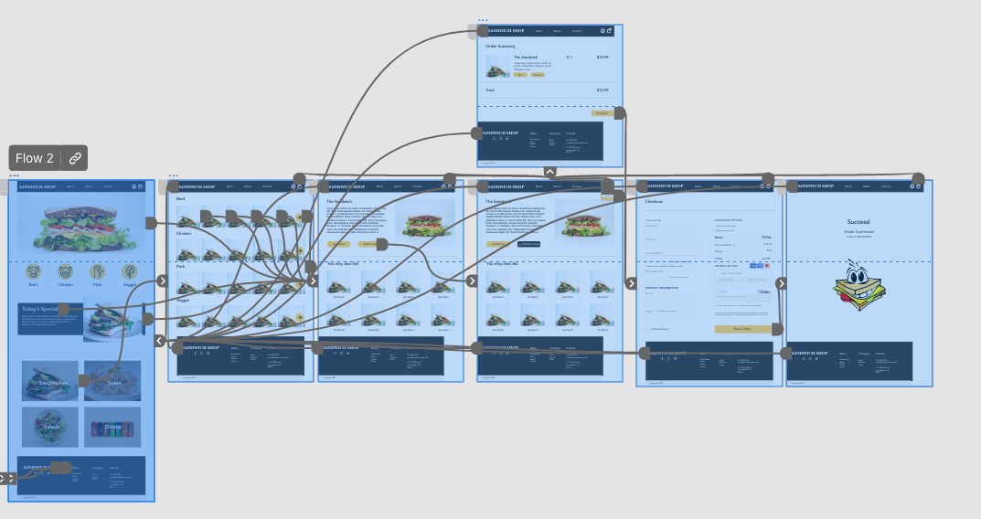
Sandwich Shop Protoype
Outcomes
Impact
The modifications we implemented had a positive impact on our target audience’s ability to navigate through the Sandwich Shop ordering process with greater ease. Users were able to locate the necessary sections more effectively, resulting in a smoother overall flow.
What I learned:
Based on my experience, I have come to realize that even minor tweaks to the user experience can make a substantial difference. It is crucial to acknowledge that assumptions can be wrong and that research is crucial in informing decisions. For instance, after running usability studies, I identified the need to provide more flexibility to users in terms of editing their cart and creating accounts.
Next Steps
1. Conduct another usability study to determine if the previous challenges have been addressed.
2. New features and pages should be discovered and ideation will be required.
